
Logo Files
Primary Logos — use these whenever you can.


Stacked Lockup - Fern
Use in most cases as long as the background color is light.
PNG | SVG
Logo Variations — use these when you cannot use the main full color logo.

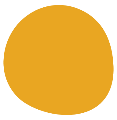
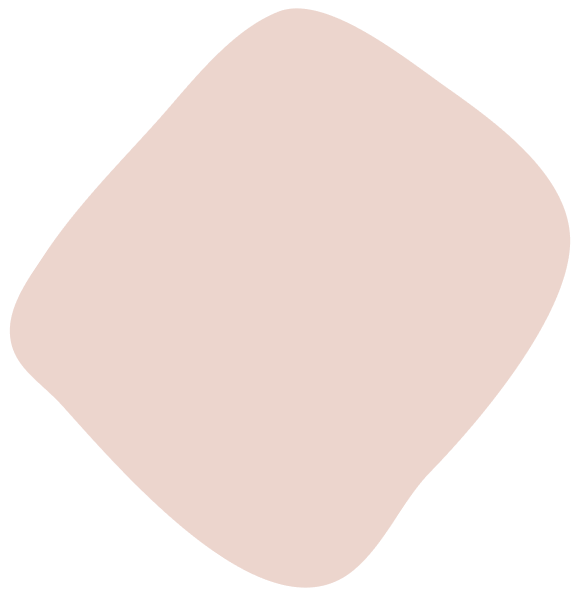
Color
#FF5858
Pulse
#F8F2E6
Paper
#E6CAB9
Clay
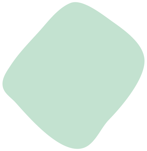
#BED6BC
Mineral
#E39E1F
Pollen
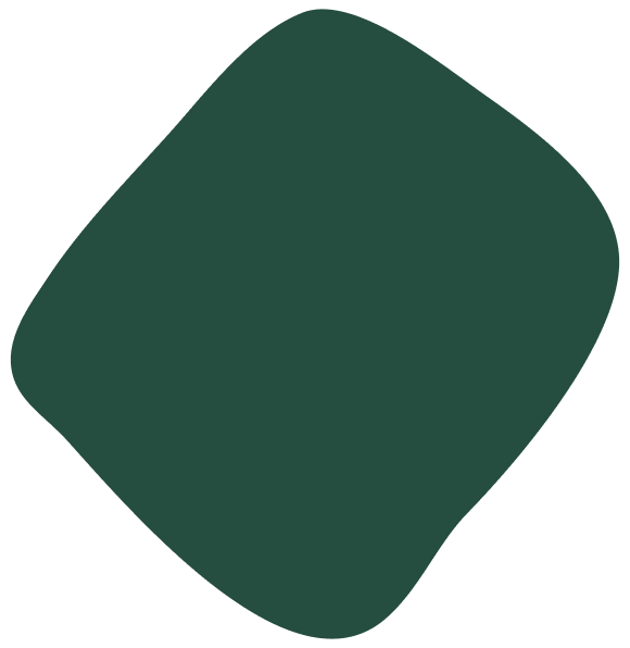
#255C43
Fern
Typography
H1 - Sentence Case, Bold, 170px, -5 Letter Spacing
ADONIS
H2 - Sentence Case, Bold, 120px, -5 Letter Spacing
Adonis
H3 - Sentence Case, Bold, 90px
ADONIS
H4 - Sentence Case, Regular, 40px
ARTICULAT CF
Articulat CF — Lorem ipsum dolor sit amet, consectetur adipiscing elit, sed do eiusmod tempor incididunt ut labore et dolore magna aliqua. Ut enim ad minim veniam, quis nostrud exercitation ullamco laboris nisi ut aliquip ex ea commodo consequat.
Paragraph 1 - Regular, 30px
Articulat CF — Lorem ipsum dolor sit amet, consectetur adipiscing elit, sed do eiusmod tempor incididunt ut labore et dolore magna aliqua. Ut enim ad minim veniam, quis nostrud exercitation ullamco laboris nisi ut aliquip ex ea commodo consequat.
Paragraph 2 - Regular, 20px
Articulat CF — Lorem ipsum dolor sit amet, consectetur adipiscing elit, sed do eiusmod tempor incididunt ut labore et dolore magna aliqua. Ut enim ad minim veniam, quis nostrud exercitation ullamco laboris nisi ut aliquip ex ea commodo consequat.
Paragraph 3 - Regular, 15px
Monospace
Articulat CFGraphics
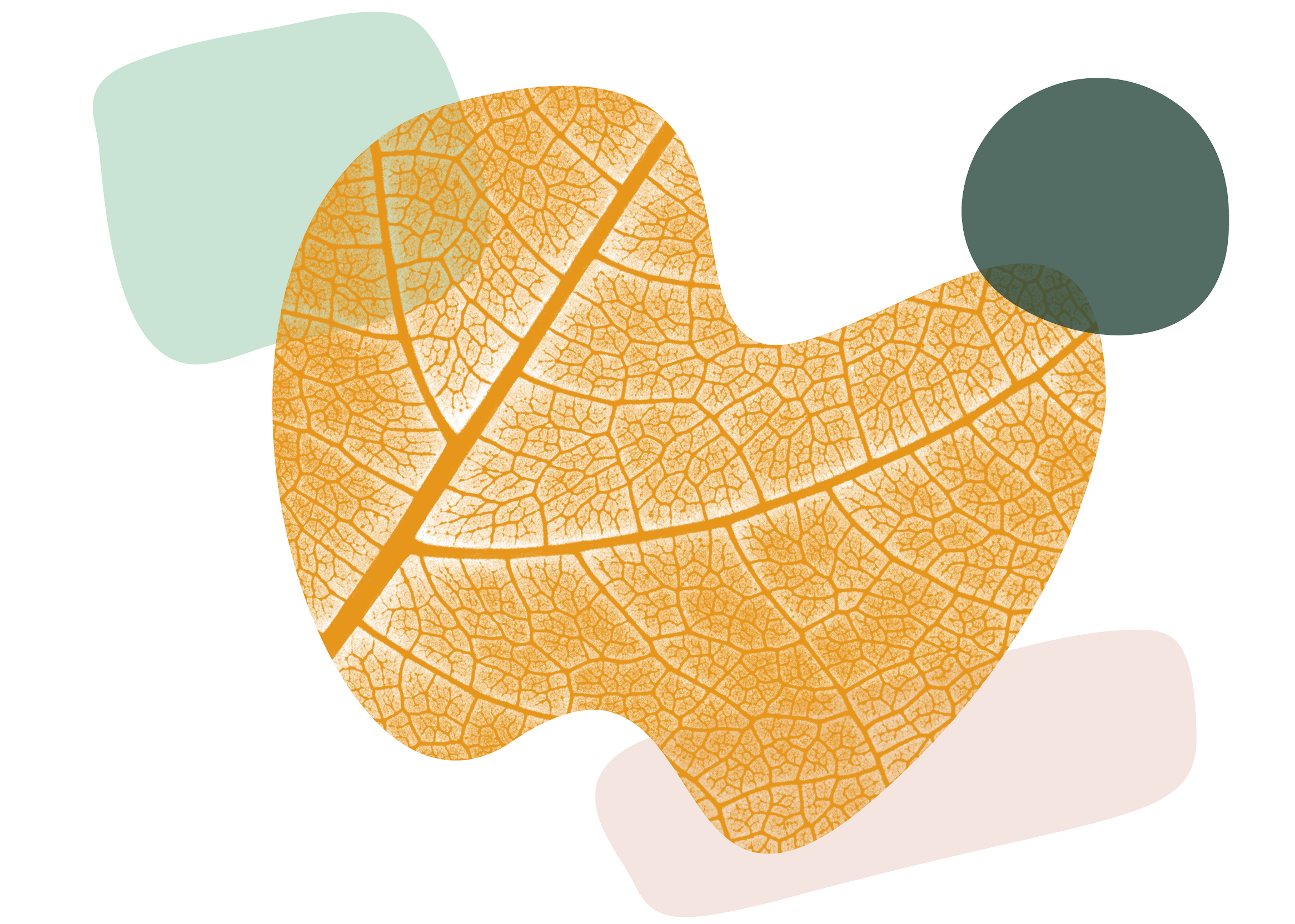
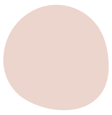
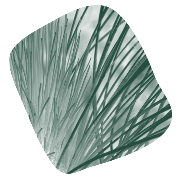
Hero - Use as feature element for contact.
PNG

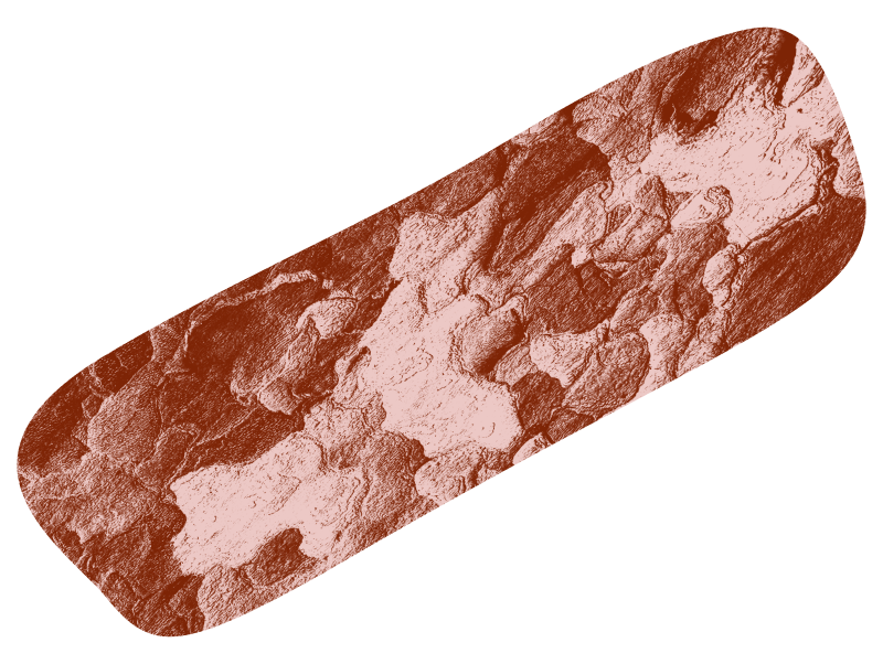
Secondary Hero - Use as feature element for contact.
PNG

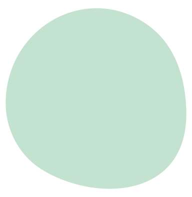
Supporting - use as a smaller, additional element when other graphics lead.
PNG


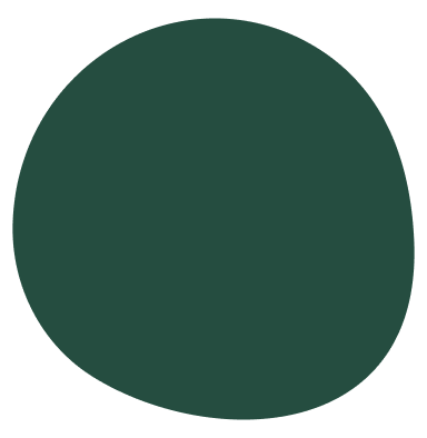
Hero - use as feature element for grief/end of life.
PNG
Secondary Hero - use as feature element for grief/end of life.
PNG
Supporting - use as a smaller, additional element when other graphics lead.
PNG

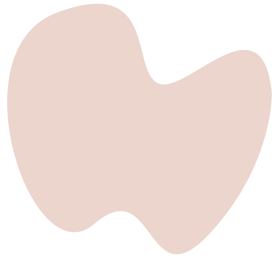
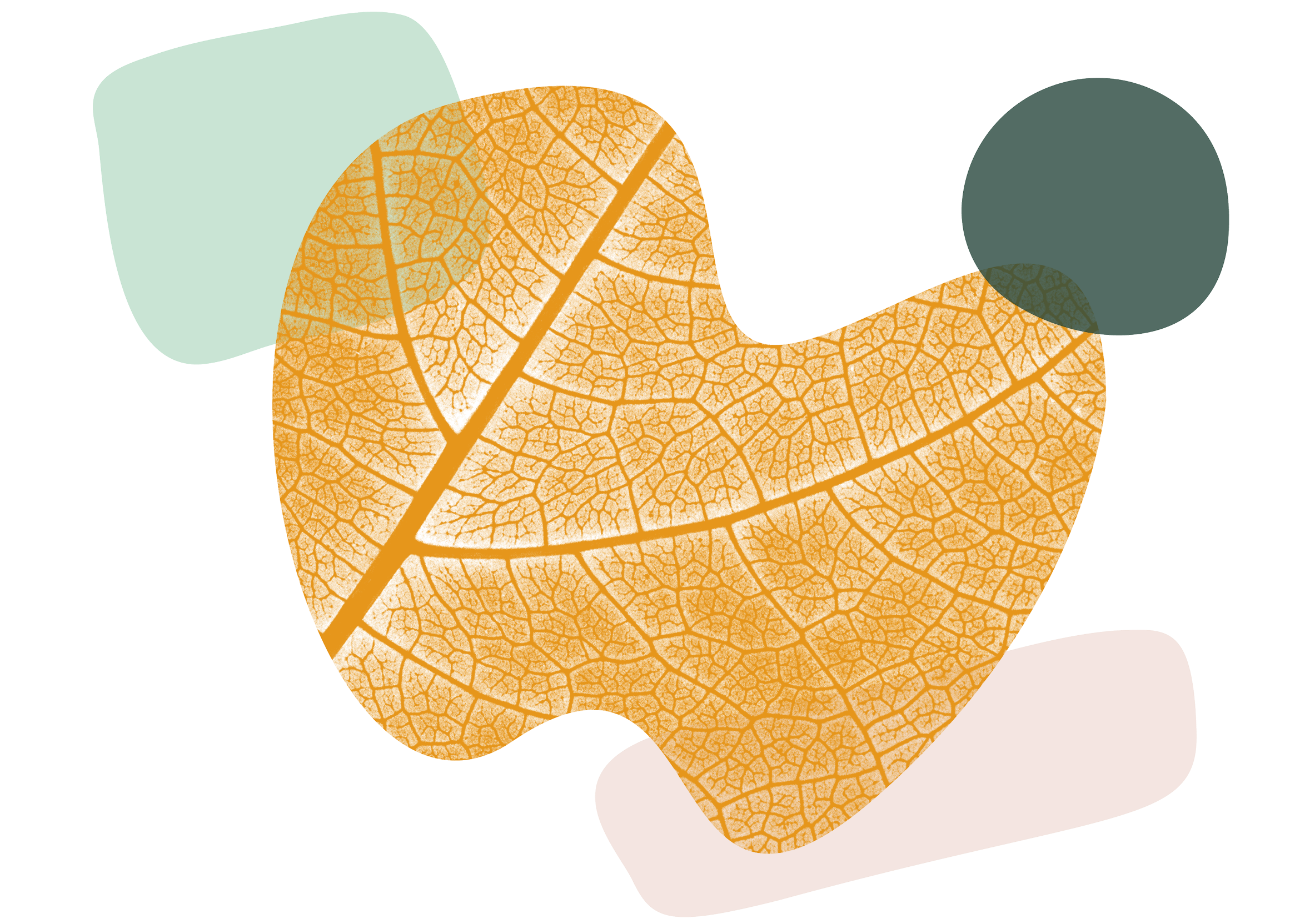
Hero - use as the feature element on homepage and overall about.
PNG

Secondary Hero - use as the feature element on homepage and overall about.
PNG

Supporting - use as a smaller, additional element when other graphics lead.
PNG

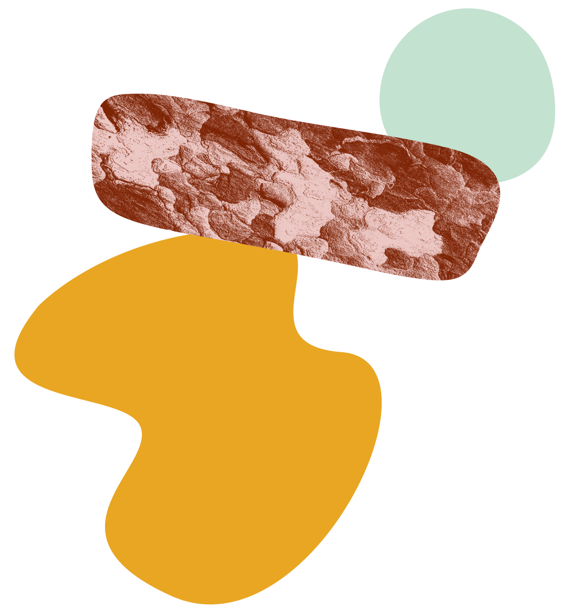
Tips:
Settle on story, first. What is the most important message? And how can your graphics draw the eye to add emphasis to your main points.
Remember the golden ratio, and keep a visual balance.
You don’t need to use every color in your palette at once. In most cases 2-3 colors works nicely.
Be conscientious about white space—do graphics have sufficient space around them to really let them sing?
Be careful about scale. Smaller graphics can add ambience at best, and feel overwhelming at worst. Large graphics can create bold visual interest at best, and make the viewer feel cramped at worst.
In general, graphics will feel best proportionally large when layered over imagery. It should feel almost like a texture.
Follow color palette guidelines and use dark text on light backgrounds, and light text on dark backgrounds to ensure readability.


PNG
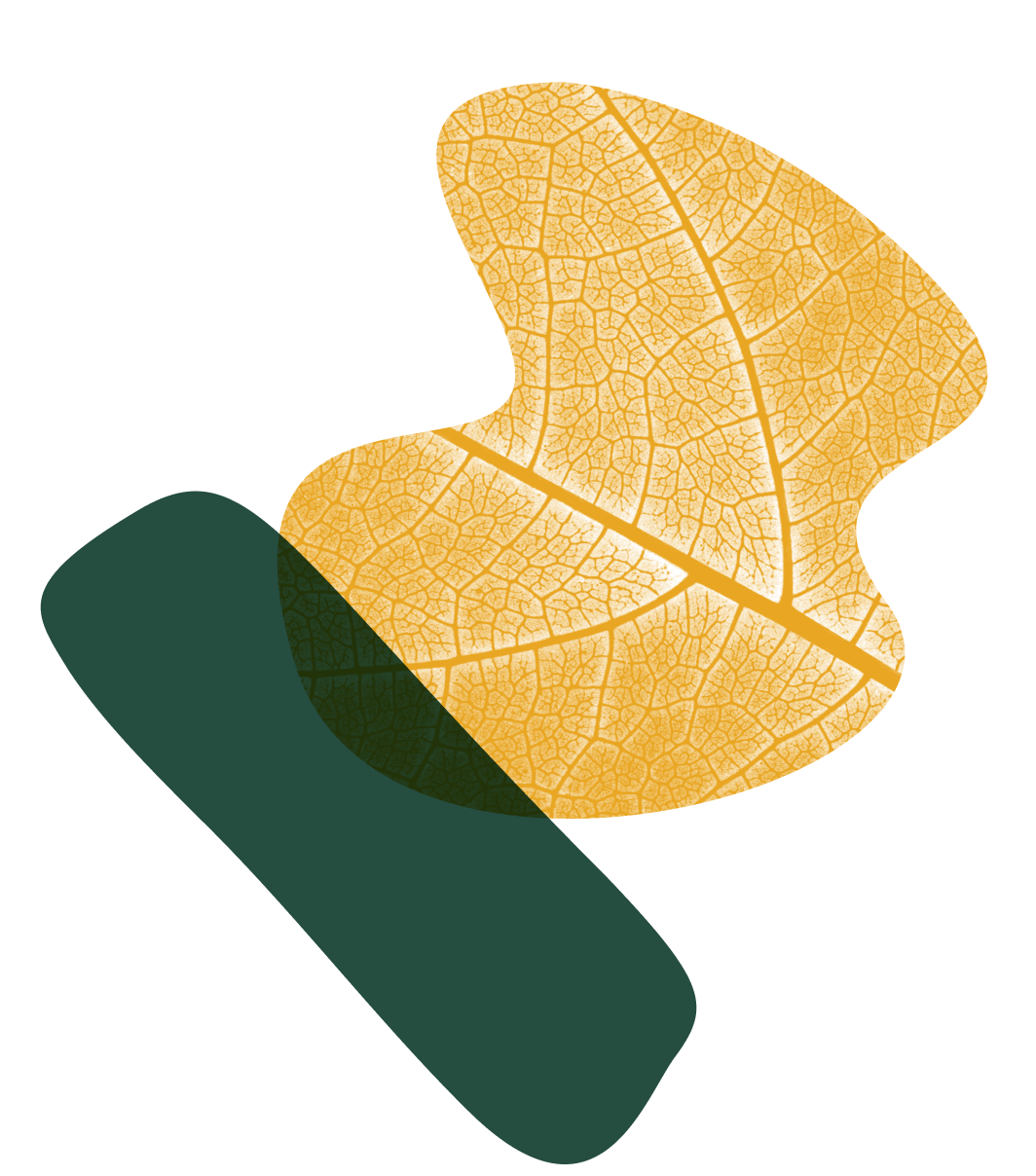
Hero - use as feature element for leadership coaching.
PNG
Secondary Hero - use as feature element for leadership coaching.
PNG
Supporting - use as a smaller, additional element when other graphics lead.
PNG


Supporting - use as a smaller, additional element when other graphics lead.
PNG

Supporting - use as a smaller, additional element when other graphics lead.
PNG
Supporting - use as a smaller, additional element when other graphics lead.
PNG
Supporting - use as a smaller, additional element when other graphics lead.
PNG
Supporting - use as a smaller, additional element when other graphics lead.
PNG

Supporting - use as a smaller, additional element when other graphics lead.
PNG
Supporting - use as a smaller, additional element when other graphics lead.
PNG
Supporting - use as a smaller, additional element when other graphics lead.
PNG